WPF Popup
This tutorial shows you how to create and use a Popup control available in Windows Presentation Foundation (WPF) and XAML.
WPF Popup
A popup window is a window that floats over a page or window providing functionality for some quick action. For example a login control on a page or provide an animated popup tip. Fortunately, WPF comes with a Popup control to provide this functionality.
This tutorial shows you how to create and use a Popup control available in Windows Presentation Foundation (WPF) and XAML.
Introduction
The Popup tag represents a WPF Popup control in XAML.
<Popup></Popup>
The Width and Height properties represent the width and the height of a Popup. The Name property represents the name of the control, which is a unique identifier of a control. The Margin property tells the location of a Popup on the parent control. The HorizontalAlignment and VerticalAlignment properties are used to set horizontal and vertical alignments.
The following code snippet sets the name, height, and width of a Popup control. The code also sets horizontal alignment to left and vertical alignment to top.
<Popup Margin="10,10,0,13" Name="Popup1" HorizontalAlignment="Left"
VerticalAlignment="Top" Width="194" Height="200" />
To make a popup control visible, you need to set IsOpen property to true.
IsOpen="True"
Adding Popup Contents
A Popup control can have only one child. The following code snippet adds a text block to the popup control.
<Popup Margin="10,10,0,13" Name="Popup1" HorizontalAlignment="Left"
VerticalAlignment="Top" Width="194" Height="200" IsOpen="True">
<TextBlock Name="McTextBlock"
Background="LightBlue" >
This is popup text
</TextBlock>
</Popup>
If you wish to add more contents to the popup control, you may have a stack panel or grid as a child control and place more contents on the panel or grid controls. The following code snippet creates a stack panel and places some contents on it.
<Popup Margin="10,10,0,13" Name="Popup1" HorizontalAlignment="Left" VerticalAlignment="Top" Width="194" Height="200" IsOpen="True">
<StackPanel>
<TextBlock Name="McTextBlock"
Background="LightBlue" >
This is popup text
</TextBlock>
<Button Content="This is button on a Pupup" />
</StackPanel>
</Popup>
The popup created using the above code looks like Figure 1.
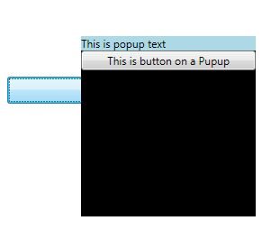
Figure 1. Popup window
Animated Popup
Once you have a popup content defined, you can do anything with this content depending on the controls. For instance, if you are using an image as content, you can do anything with popup what you can do with the image.
The following code shows how to animate a popup window.
<StackPanel>
<CheckBox Name="PCheckBox" Margin="10,10,0,0"
Content="Popup Window"/>
<Button HorizontalAlignment="Left" Width="129" Margin="10,10,0,0">
<Button.Triggers>
<EventTrigger RoutedEvent="Button.Click">
<BeginStoryboard>
<Storyboard>
<DoubleAnimation
Storyboard.TargetName="theTransform"
Storyboard.TargetProperty="(RotateTransform.Angle)"
From="0" To="360" Duration="0:0:5" AutoReverse="True"/>
</Storyboard>
</BeginStoryboard>
</EventTrigger>
</Button.Triggers>
Start Animation
</Button>
<Popup IsOpen="{Binding ElementName=PCheckBox,Path=IsChecked}"
PlacementTarget="{Binding ElementName=PCheckBox}"
AllowsTransparency="True"
PopupAnimation="Slide"
HorizontalOffset="150"
VerticalOffset="100" >
<Canvas Width="100" Height="100" Background="Green" Margin="150">
<Canvas.RenderTransform>
<RotateTransform x:Name="theTransform" />
</Canvas.RenderTransform>
<TextBlock TextWrapping="Wrap" Foreground="LightGray">
Rotating Popup
</TextBlock>
</Canvas>
</Popup>
</StackPanel>
Summary
In this article, I discussed how to create and use a Popup control available in WPF. The article also shows how to animate a popup.
If you have a cool sample code on this topic and would like to share with us, click here.