A DatePicker control is used to create a visual DatePicker that let user to pick a date and fire an event on the selection of the date. This article demonstrates how to create and use a DatePicker control in WPF with the help of XAML and VB.NET.
Creating a DatePicker
The DatePicker element represents a WPF DatePicker control in XAML.
<DatePicker/>
The DatePicker control is defined in the System.Windows.Controls namespace. When you drag and drop a DatePicker control from Toolbox to the page, you will notice the code listed in Listing 1 is added to the XAML file for the DatePicker control.
<DatePicker Height="25" HorizontalAlignment="Left" Margin="42,26,0,0" Name="datePicker1"
VerticalAlignment="Top" Width="115" />
Listing 1
The Width and Height attributes of the DatePicker element represent the width and the height of a DatePicker. The Content attribute represents the text of a DatePicker. The Name attribute represents the name of the control, which is a unique identifier of a control.
When you run this code, you will see a TextBox with text Select a date and when you click on this TextBox or the date, Calendar dropdown will appear where you can select a date. The selected date will be the date in the TextBox as you can see in Figure 1.
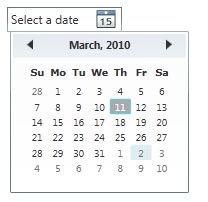
Figure 1
Display Date
The DisplayDate property represents the date to display. The default is today.
IsDropDownOpen
The IsDropDownOpen property indicates if the calendar part of the DatePicker control is open or closed.
Text Property
The Text property represents the text that is displayed in the DatePicker.
Selection Date and Selection Date Format
The SelectedDate property represents the currently selected date. If multiple dates selection is true, the SelectedDates property represents a collection of currently selected dates.
BlackoutDates
The BlackoutDates property of the DatePicker class represents a collection of dates that are not available for selection. All non selection dates are marked by a cross. For example, say in March month of year 2010, we would like to block dates from Jan 1st to Jan 7th and then all Sundays and the final DatePicker should look like Figure 2.
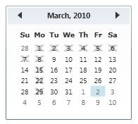
Figure 2
The following code snippet adds backout dates to a DatePicker.
<DatePicker.BlackoutDates>
<CalendarDateRange Start="3/1/2010" End="3/7/2010"/>
<CalendarDateRange Start="3/8/2010" End="3/8/2010"/>
<CalendarDateRange Start="3/15/2010" End="3/15/2010"/>
<CalendarDateRange Start="3/22/2010" End="3/22/2010"/>
<CalendarDateRange Start="3/29/2010" End="3/29/2010"/>
</ DatePicker.BlackoutDates>
We can achieve this by adding code listed in Listing 2. As you can see from Listing 3, the BlackoutDates.Add method takes a CalendarDateRange object, which is a collection of two DateTime objects. The first date is the start date of the range and second date is the end date of the date range.
Private Sub SetBlackOutDates()
MonthlyCalendar.BlackoutDates.Add(New CalendarDateRange(New DateTime(2010, 3, 1), New DateTime(2010, 3, 7)))
MonthlyCalendar.BlackoutDates.Add(New CalendarDateRange(New DateTime(2010, 3, 8), New DateTime(2010, 3, 8)))
MonthlyCalendar.BlackoutDates.Add(New CalendarDateRange(New DateTime(2010, 3, 15), New DateTime(2010, 3, 15)))
MonthlyCalendar.BlackoutDates.Add(New CalendarDateRange(New DateTime(2010, 3, 22), New DateTime(2010, 3, 22)))
MonthlyCalendar.BlackoutDates.Add(New CalendarDateRange(New DateTime(2010, 3, 29), New DateTime(2010, 3, 29)))
End Sub
Listing 2
DisplayDateStart and DisplayDateEnd
The DatePicker control allows you to set the start and end display dates by using the DisplayDateStart and DisplayDateEnd properties. If you see Figure 2 in the previous section, you may notice the March 2010 month DatePicker display start with March 01, 2010 date. But now what if you want to display dates for March 2010 month only? We can use the DisplayStartDate and DisplayEndDate properties to control the start and end dates of a month.
DisplayDate property represents the current date to display.
The following code snippet sets the DisplayDate, DisplayDateStart and DisplayDateEnd attributes of DatePicker element in XAML.
<DatePicker Name="MonthlyCalendar"
SelectionMode="MultipleRange"
DisplayDate="3/1/2010"
DisplayDateStart="3/1/2010"
DisplayDateEnd="3/31/2010"
/>
The code listed in Listing 3 makes sure the start date is March 01, 2010 and end date is March 31, 2010. The current selected date is March 05.
Private Sub SetDisplayDates()
MonthlyCalendar.DisplayDate = New DateTime(2010, 3, 5)
MonthlyCalendar.DisplayDateStart = New DateTime(2010, 3, 1)
MonthlyCalendar.DisplayDateEnd = New DateTime(2010, 3, 31)
End Sub
Listing 3
The new DatePicker looks like Figure 3.
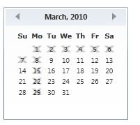
Figure 3
FirstDayOfWeek and IsTodayHighlighted
By default, Sunday is the first day of week. If you would like to change it, you use FirstDayOfWeek property. The IsTodayHightlighted property is used to make today highlighted.
The following code snippet sets the FirstDayOfWeek to Tuesday and makes today highlighted.
<DatePicker Name="MonthlyCalendar"
SelectionMode="MultipleRange"
DisplayDate="3/5/2010"
DisplayDateStart="3/1/2010"
DisplayDateEnd="3/31/2010"
FirstDayOfWeek="Tuesday"
IsTodayHighlighted="True"
xmlns:sys="clr-namespace:System;assembly=mscorlib" Margin="15,39,88,19">
The following code snippet sets the FirstDayOfWeek to Tuesday and makes today highlighted in WPF.
MonthlyCalendar.FirstDayOfWeek = DayOfWeek.Tuesday;
MonthlyCalendar.IsTodayHighlighted = true;
The new DatePicker looks like Figure 4, where you can see the start day of the week us Tuesday.
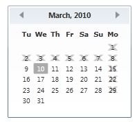
Figure 4
Selected Date and Selected Dates
SelectedDate property represents the current selected date. If multiple date selection is true, then SelectedDates property represents all selected dates in a DatePicker. The following code snippet sets the SelectedDates in XAML at design-time.
<DatePicker Name="MonthlyCalendar"
SelectionMode="MultipleRange"
DisplayDate="3/5/2010"
DisplayDateStart="3/1/2010"
DisplayDateEnd="3/31/2010"
FirstDayOfWeek="Tuesday"
IsTodayHighlighted="True"
xmlns:sys="clr-namespace:System;assembly=mscorlib" Margin="15,39,88,19">
<DatePicker.SelectedDates>
<sys:DateTime>3/5/2010</sys:DateTime>
<sys:DateTime>3/15/2010</sys:DateTime>
<sys:DateTime>3/25/2010</sys:DateTime>
</DatePicker.SelectedDates>
</DatePicker>
The selected dates in a DatePicker looks like Figure 5 where you can see March 5th, 15th, and 25th have a light blue background and represents the selected dates.
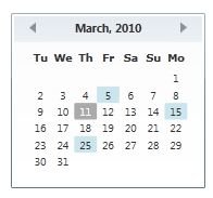
Figure 5
The following code snippet sets the SelectedDates property in WPF at run-time.
Private Sub AddSelectedDates()
MonthlyCalendar.SelectedDates.Add(New DateTime(2010, 3, 5))
MonthlyCalendar.SelectedDates.Add(New DateTime(2010, 3, 15))
MonthlyCalendar.SelectedDates.Add(New DateTime(2010, 3, 25))
End Sub
Note: If you set selected dates to any of the blockout dates, you will see parser in XAML will through an error like Figure 6.
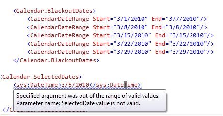
Figure 6
DatePicker Events
Besides the normal control events, the DatePicker control has three events DatePicker related events. These events are the DisplayDateChanged, DisplayModeChanged, and SelectedDatesChanged. The DisplayDateChanged event is fired where the DisplayDate property is changed. The DisplayModeChanged event is fired when the DisplayMode property is changed. The SelectedDatesChanged event is fired when the SelectedDate or SelectedDates properties are changed. The following code snippet sets these three events attributes.
<DatePicker SelectionMode="SingleRange"
Name="MonthlyCalendar"
SelectedDatesChanged="MonthlyCalendar_SelectedDatesChanged"
DisplayDateChanged="MonthlyCalendar_DisplayDateChanged"
DisplayModeChanged="MonthlyCalendar_DisplayModeChanged"
HorizontalAlignment="Left"
VerticalAlignment="Top"
Margin="10,10,0,0">
</DatePicker>
The code behind for these events looks like Listing 4.
Private Sub MonthlyCalendar_SelectedDatesChanged(ByVal sender As Object, ByVal e As SelectionChangedEventArgs)
End Sub
Private Sub MonthlyCalendar_DisplayDateChanged(ByVal sender As Object, ByVal e As CalendarDateChangedEventArgs)
End Sub
Private Sub MonthlyCalendar_DisplayModeChanged(ByVal sender As Object, ByVal e As CalendarModeChangedEventArgs)
End Sub
Listing 4
Normally, on a date selection, you may want to capture that event and know what the current selected date is. Now how about we add a TextBox control to the page and on the date selection, we are going to set the text of the TextBox to the currently selected date.
We add the following code to the XAML just below the DatePicker control.
<TextBox Width="200" Height="30"
VerticalAlignment="Bottom"
HorizontalAlignment="Left"
Margin="10,10,10,10"
x:Name="SelectedDateTextBox">
</TextBox>
On the SelectedDateChanged event handler, we set the TextBox.Text property to the SelectedDate property of the DatePicker control as you can see from code in Listing 5.
Private Sub MonthlyCalendar_SelectedDatesChanged(ByVal sender As Object, ByVal e As SelectionChangedEventArgs)
SelectedDateTextBox.Text = MonthlyCalendar.SelectedDate.ToString()
End Sub
Listing 5
Now when you run the application, you will see output looks like Figure 7. When you select a date in the DatePicker, it will be displayed in the Textbox.
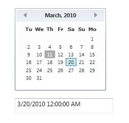
Figure 7
Formatting a DatePicker
How about we create a DatePicker control with a border formatting, background, and foreground of the DatePicker?
The BorderBrush property of the DatePicker sets a brush to draw the border of a DatePicker. You may use any brush to fill the border. The following code snippet uses a linear gradient brush to draw the border with a combination of red and blue color.
<DatePicker.BorderBrush>
<LinearGradientBrush StartPoint="0,0" EndPoint="1,1" >
<GradientStop Color="Blue" Offset="0" />
<GradientStop Color="Red" Offset="1.0" />
</LinearGradientBrush>
</DatePicker.BorderBrush>
The Background and Foreground properties of the DatePicker set the background and foreground colors of a DatePicker. You may use any brush to fill the border. The following code snippet uses linear gradient brushes to draw the background and foreground of a DatePicker.
<DatePicker.Background>
<LinearGradientBrush StartPoint="0,0" EndPoint="1,1" >
<GradientStop Color="Blue" Offset="0.1" />
<GradientStop Color="Orange" Offset="0.25" />
<GradientStop Color="Green" Offset="0.75" />
<GradientStop Color="Red" Offset="1.0" />
</LinearGradientBrush>
</DatePicker.Background>
<DatePicker.Foreground>
<LinearGradientBrush StartPoint="0,0" EndPoint="1,1" >
<GradientStop Color="Black" Offset="0.25" />
<GradientStop Color="Green" Offset="1.0" />
</LinearGradientBrush>
</DatePicker.Foreground>
The new DatePicker looks like Figure 8.
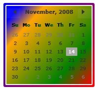
Figure 8
Setting Image as Background of a DatePicker
To set an image as background of a DatePicker, we can set an image as the Background of the DatePicker. The following code snippet sets the background of a DatePicker to an image. The code also sets the opacity of the image.
<DatePicker.Background>
<ImageBrush ImageSource="Garden.jpg" Opacity="0.3"/>
</DatePicker.Background>
The new output looks like Figure 9.
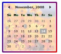
Figure 9
Creating a DatePicker Dynamically
The code listed in Listing 6 creates a DatePicker control programmatically. First, it creates a DatePicker object and sets its DisplayMode and SelectedMode and other properties and later the DatePicker is added to the LayoutRoot.
Private Sub CreateDynamicDatePicker()
Dim MonthlyCalendar As New DatePicker()
MonthlyCalendar.Name = "MonthlyCalendar"
MonthlyCalendar.Width = 300
MonthlyCalendar.Height = 400
MonthlyCalendar.Background = Brushes.LightBlue
MonthlyCalendar.DisplayMode = CalendarMode.Month
MonthlyCalendar.SelectionMode = CalendarSelectionMode.SingleRange
MonthlyCalendar.DisplayDateStart = New DateTime(2010, 3, 1)
MonthlyCalendar.DisplayDateEnd = New DateTime(2010, 3, 31)
MonthlyCalendar.SelectedDates.Add(New DateTime(2010, 3, 5))
MonthlyCalendar.SelectedDates.Add(New DateTime(2010, 3, 15))
MonthlyCalendar.SelectedDates.Add(New DateTime(2010, 3, 25))
MonthlyCalendar.FirstDayOfWeek = DayOfWeek.Monday
MonthlyCalendar.IsTodayHighlighted = True
LayoutRoot.Children.Add(MonthlyCalendar)
End Sub
Listing 6
Summary
In this article, I discussed how we can create a DatePicker control in WPF and VB.NET. We also saw how to set display modes, selection modes, blackout dates, selected dates, border, background, and foreground properties. After that, we saw you to set an image as the background of a DatePicker. In the end of this article, we saw how to create a DatePicker dynamically.