TabControl
The TabControl is used to Represents a control that contains multiple items that share the same space on the screen.
Creating TabControl in XAML
<TabControl Height="233" HorizontalAlignment="Left" Margin="10,10,0,0" Name="TabControl1" VerticalAlignment="Top" Width="333" Grid.ColumnSpan="2">
</TabControl>
The Width and Height property represents the width and the height of the control. Name property represents name of the control. The Header property of TabControl represents the header text of the header.
Header - The Header property of TabControl represents the header text of the header.
For example
Addding two TabControl one named is design and other is XAML code. In design Form we takes a Image control and XAML code tab we takes TextBlock controls.
XAML code
<Window x:Class="WpfApplication60.MainWindow"
xmlns="http://schemas.microsoft.com/winfx/2006/xaml/presentation"
xmlns:x="http://schemas.microsoft.com/winfx/2006/xaml"
Title="MainWindow" Height="350" Width="525" Loaded="Window_Loaded">
<Grid>
<Grid.ColumnDefinitions>
<ColumnDefinition Width="501*" />
<ColumnDefinition Width="2*" />
</Grid.ColumnDefinitions>
<TabControl Height="233" HorizontalAlignment="Left" Margin="10,10,0,0" Name="TabControl1" VerticalAlignment="Top" Width="333" Grid.ColumnSpan="2">
<TabItem Header="Picture" Name="TabItem1">
<Grid>
<Image Height="150" HorizontalAlignment="Left" Margin="10,10,0,0" Name="Image1" Stretch="Fill" VerticalAlignment="Top" Width="200" Source="/WpfApplication60;component/Images/file5.jpg" />
</Grid>
</TabItem>
<TabItem Header="XAML code" Name="TabItem2">
<Grid>
<Grid.ColumnDefinitions>
<ColumnDefinition Width="56*" />
<ColumnDefinition Width="148*" />
<ColumnDefinition Width="119*" />
</Grid.ColumnDefinitions>
<TextBlock Height="23" HorizontalAlignment="Left" Margin="10,10,0,0" Name="TextBlock1" Text="<Image Height="150" HorizontalAlignment="Left"" VerticalAlignment="Top" Grid.ColumnSpan="3" />
<TextBlock Height="23" HorizontalAlignment="Left" Margin="10,43,0,0" Name="TextBlock2" Text="Margin="19,15,0,0" Name="Image1"" VerticalAlignment="Top" Grid.ColumnSpan="2" />
<TextBlock Height="23" HorizontalAlignment="Left" Margin="10,76,0,0" Name="TextBlock3" Text="Stretch="Fill" VerticalAlignment="Top" Width="200"" VerticalAlignment="Top" Grid.ColumnSpan="3" />
<TextBlock Height="23" HorizontalAlignment="Left" Margin="-2,109,0,0" Name="TextBlock4" Text="Source="/SilverlightApplication44;component/Images/flowers-image.jpg" />" VerticalAlignment="Top" Grid.ColumnSpan="3" />
</Grid>
</TabItem>
</TabControl>
</Grid>
</Window>
Now run the application, the picture tab shows a image looks like this.
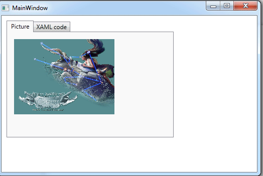
Figure1.gif
Now click on the XAML code Tab.
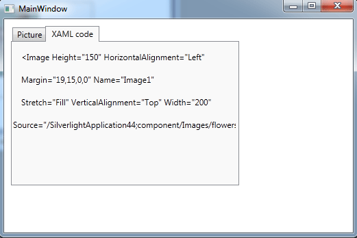
Figure2.gif