In this article we will learn how to define the standard controls in ASP.NET.
Standard Controls
Standard controls are those controls which are mostly used in web application. These are the following standard controls.
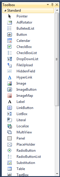
Figure 1.
Standard Controls
Standard controls are those controls which are mostly used in web application. These are the following standard controls.
Pointer: Pointer are used to point the control. If we drag any other control on form it causes to create that control on form but pointer does not create any control on form.
AdRotator: The AdRotator control presents ad images that, when clicked, navigate to a new Web location. Each time the page is loaded into the browser, an ad is randomly selected from a predefined list. Assume that we have an area on web page where we want to display adds of our four clients then we can use adrotator control.
BulletedList: The BulletedList control is used to create a list of items formatted with bullets.
Button: The Button control is used to post a Web Forms page back to the server.
Calender: The Calendar control displays a month calendar from which users can select dates.
CheckBox: The CheckBox control accepts Boolean (true or false) input. When selected, its Checked property is true. CheckBox cannot be bind with database.
CheckBoxList: The CheckBoxList control provides a multiple-selection checked list. Like other list controls, CheckBoxList has an Items collection with members that correspond to each item in the list. To determine which items are selected, test the Selected property of each item.
DropDownList: This control is used to select any one item from list of items. We can not select multiple items from dropdownlist. It has also database binding property.
FileUpload: The FileUpLoad control enables you to upload file to the server. It displays a text box control and a browse button that allow users to select a file to upload to the server.
HiddenField: The HiddenField control is used to store a value without displaying it on the page. Normally view state, session state, and cookies are used to maintain the state of a Web Forms page However, if these methods are disabled or are not available, you can use the HiddenField control to store state values.
HyperLink: Hyperlink control is used to link one page to any other page.
Image: This control is used to display the image on the form and using ImageUrl property we can change the image.
ImageButton: This control looks like button control but it has image. We simply click on image and works like button control. We can set its image using ImageUrl property.
ImageMap: ImageMap control to create an image that contains defined hotspot regions. When a user clicks a hot spot region, the control can either generate a post back to the server or navigate to a specified URL.
Label: This control is used to display some text at the specific location on the form.
LinkButton: Like the Button control, LinkButton is used to post a Web Forms page back to the server.
ListBox: The ListBox control provides a single-selection or multiple-selection list. To enable multiple selection, set the SelectionMode property to Multiple.
Literal: A Literal control is used to display text. You cannot apply a style to a literal control. This control will pass the content directly to the client browser, unless you use the Mode property to encode the content.
MultiView and View: The MultiView control represents a control that acts as a container for groups of View controls. It allows you to define a group of View controls, where each View control contains child controls.
Panel: The Panel control is a container for other controls. It is especially useful when you want to generate controls programmatically or hide or show a group of controls.
PlaceHolder: The PlaceHolder control can be used as a container control within a document to dynamically load other controls.
RadioButton: A radio button or option button is a type of graphical user interface element that allows the user to choose only one of a predefined set of options.
RadioButtonList: RadioButton is the collection of radio buttons, and it has one great advantage database binding property.
Substituting: Substitution control to specify a section of an output-cached Web page where you want to display dynamic content.
Table: The Table control builds up a table programmatically by adding TableRows to the Rows collection of the table, and TableColumn to the Columns collection of the row. You can add content to a table column programmatically by adding controls to the Controls collection of the columns.
TextBox: The TextBox control enables the user to enter text. By default, the TextMode of TextBox is SingleLine, but you can modify the behavior of TextBox by setting the TextMode to Password or MultiLine.
Wizard: The Wizard control provides navigation through a series of steps that collect information incrementally from a user. The most familiar applications that can be developed using Wizard are online tests, online quizzes, registration process that span several pages.
XML: The Xml control can be used to write out an XML document or the results of an XSL Transform.