Menus in WPF
This tutorial shows you how to create and use a Menu control available in Windows Presentation Foundation (WPF).
Menus in XAML and WPF
In XAML and WPF model, the Menu and the MenuItem classes represent a menu and a menu item respectively. A Menu is a collection of menu items with a command associated with each menu items. A menu item may have children menu items called submenus. This article discusses how to work with menus in XAML and WPF applications.
Creating a Menu as Design Time
The Menu tag in XAML creates a menu control.
The Name property defines the name of the menu and Height and Width represents the height and width of a menu control.
<Menu Name="menu1" Height="22" Width="200" />
To position a menu control in a Window, the Margin, HorizontalAlignment and VerticalAlignment properties may be used. The following code sets horizontal, vertical alignments, margin, and background color of a menu control.
<Menu Height="22" Name="menu1" Width="200" Margin="10, 10, 5, 5"
HorizontalAlignment="Left" VerticalAlignment="Top" Background="Chocolate">
</Menu>
Setting Menu Control Properties
There are three ways to set a menu control properties. You may use the Properties windows, set properties in XAML manually, or set properties at run-time using WPF code.
If you right click on the menu control and select Properties menu item, you will see the Properties window same as Figure 1.
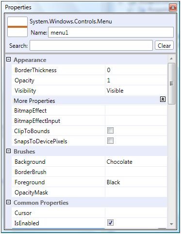
Figure 1. Properties Window
As you can see from Figure 1, you can set all properties of a Menu control through this Window such as border thickness, opacity, bitmap effects, background and foreground colors, alignments, width and height, layouts, and fonts.
Once you set properties in the Properties window, the respective XAML code is written in the XAML file by the designer. For example, I set BorderThickness to 2, BitmapEffect to DropShadowEffect, and Background to Blue as shown in Figure 2.
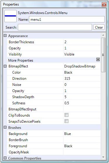
Figure 2. Setting a Menu Control Properties
If you look at the XAML file now, you will see Menu code like below where you can see BorderThickness is set to 2, Background is set to Blue, and Menu.BitmapEffect tag is added within the Menu tag.
<Menu Height="22" Name="menu1" Width="200" Margin="10, 10, 5, 5" HorizontalAlignment="Left" VerticalAlignment="Top" Background="Blue" BorderThickness="2">
<Menu.BitmapEffect>
<DropShadowBitmapEffect />
</Menu.BitmapEffect>
</Menu>
Now, the menu looks like Figure 3.

Figure 3. Menu with blue background and drop shadow effect
Adding Menu Items and Sub Menus to a Menu
Now let's add menu items and sub menus to the menu control. The MenuItem tag adds a menu item to the menu control. The following code shows the initial syntax of the MenuItem tag. The Header attribute is the name of the MenuItem.
<MenuItem Header="Menu Item Name " />
A MenuItem can have other MenuItem tags within it as child/sub menus and can go up to several levels. The following code adds three children menu items to first menu item.
<MenuItem Header="_File">
<MenuItem Header="_Open" IsCheckable="true"/>
<MenuItem Header="_Close" IsCheckable="true"/>
<MenuItem Header="_Save" IsCheckable="true"/>
</MenuItem>
The output looks like Figure 4.
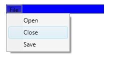
Figure 4. A menu with menu items
A separate is used to separate categories of menu items. We can add a separator to a menu control by using <Separator /> tag.
We can also ass sub menus and sub menu items using the MenuItem tag within parent a MenuItem tag. The following code adds a separator and sub menus and sub menu items to the menu.
<Separator/>
<MenuItem Header="Sub Items">
<MenuItem Header="Child1 SubItem" IsCheckable="true"/>
<MenuItem Header="Child2 SubItem" IsCheckable="true">
<MenuItem Header="GrandChild2 SubItem" IsCheckable="true"/>
</MenuItem>
</MenuItem>
Now, our new output looks like Figure 5.
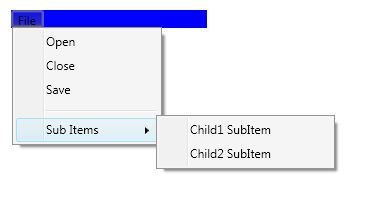
Figure 5. A menu with menu items
Adding Tooltips to Menus
The MenuItem.ToolTip tag adds a tooltip to a menu item. The following code adds a tooltip to the Open menu item.
<MenuItem Header="_Open" IsCheckable="true">
<MenuItem.ToolTip>
<ToolTip>
Open a file.
</ToolTip>
</MenuItem.ToolTip>
</MenuItem>
The output with the tooltip looks like Figure 6.
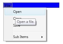
Figure 6. A menu with a tooltip
Adding a CheckBox to a Menu Item
By setting IsCheckable property of a MenuItem to true makes a menu item to a CheckBox in front of the header text.
<MenuItem IsCheckable="true">
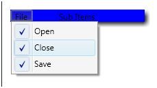
Figure 7.
Adding a Keyboard Shortcut to a Menu Item
InputGestureText property is used to add keyboard shortcut to the menu item. The following code adds CTRL+O to a menu item.
<MenuItem IsCheckable="true" Header="_Open" InputGestureText="Ctrl+O">
Adding an Event Trigger to a MenuItem
The Click event is used to add the menu item click event handler. The following code adds a click event handler for a menu item.
<MenuItem IsCheckable="true" Header="_Open" Click="MenuItem_Click">
The event handler is defined like following in the code behind. I added a message box when the menu item is clicked.
Private Sub MenuItem_Click(ByVal sender As Object, ByVal e As RoutedEventArgs)
MessageBox.Show("Menu item clicked")
End Sub
Creating a Menu Control at Run-time
The following code creates a menu and adds menu items dynamically.
Dim mainMenu As Menu = New Menu()
mainMenu.Background = Brushes.LightGreen
mainMenu.Height = 300
mainMenu.Width = 200
Dim item1 As MenuItem = New MenuItem()
item1.Width = 50
item1.Header = "First"
mainMenu.Items.Add(item1)
Dim item2 As MenuItem = New MenuItem()
item2.Width = 50
item2.Header = "Two"
item1.Items.Add(item2)
Dim item3 As MenuItem = New MenuItem()
item3.Width = 50
item3.Header = "Third"
item1.Items.Add(item3)
Summary
In this article, I discussed how we can use a Menu and MenuItem controls to create menus in a WPF application. We also saw how we can set menu properties, add menu items at design-time as well as at run-time and add menu item event handlers.