Layout Panel in WPF: Part 2
In this article I will explain about the layout and panels in WPF.
You learn the StackPanel in previous article. this article explain you the next category of Layout Panels:
Any single layout container is not enough to assemble a complete window you need to work with all layout container together. So, the next layout containers are WrapPanel and DockPanel which you have to use with the StackPanel.
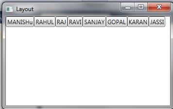
WrapPanel: The WrapPanal wrap all the child elements to new lines or column at a time if no space is left, "wrapping" it similar to the way text may be wrapeed. WrapPanel has an orientation property that can be set to Horizontal(default) or Vertical.
Example: Create a window, which contain five horizontal child buttons(the default).
The code you need to write is:
<Window x:Class="Layout.SimpleStack"
xmlns="http://schemas.microsoft.com/winfx/2006/xaml/presentation"
xmlns:x="http://schemas.microsoft.com/winfx/2006/xaml"
Title="Layout" Height="223" Width="354"
>
<WrapPanel>
<Button Content="MANISHu" />
<Button Content="RAHUL" />
<Button Content="RAJ" />
<Button Content="RAVI" />
<Button Content="SANJAY" />
<Button Content="GOPAL" />
<Button Content="KARAN" />
<Button Content="JASSI" />
</WrapPanel>
</Window>
Output window
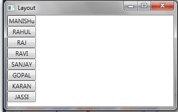
Example: By switching the orientation property to vertical see the output of above code.
The code you need to write is:
<Window x:Class="Layout.SimpleStack"
xmlns="http://schemas.microsoft.com/winfx/2006/xaml/presentation"
xmlns:x="http://schemas.microsoft.com/winfx/2006/xaml"
Title="Layout" Height="223" Width="354"
>
<WrapPanel Orientation="Vertical">
<Button Content="MANISHu" />
<Button Content="RAHUL" />
<Button Content="RAJ" />
<Button Content="RAVI" />
<Button Content="SANJAY" />
<Button Content="GOPAL" />
<Button Content="KARAN" />
<Button Content="JASSI" />
</WrapPanel>
</Window>
Output window
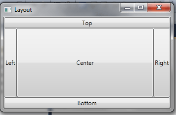
DockPanel: DockPanel is the third layout panel by using them you can easily dock the elements to the left, right, top, bottom or center of the panel. You have to define the side for the element which you want to dock according to the requirement and for this purpose WPF provides a attached property "DockPanel.Dock". For example, if you dock a button to the top of a DockPanel, it's stretched across the entire width of the DockPanel but given whatever height it requires (based on the content and the MinHeight property). On the other hand, if you dock a button to the left side of a container, its height is stretched to fit the container, but its width is free to grow as needed.
Example: Create a window, which contain one button on every side of a DockPanel.
The code you need to write is:
<Window x:Class="Layout.SimpleStack"
xmlns="http://schemas.microsoft.com/winfx/2006/xaml/presentation"
xmlns:x="http://schemas.microsoft.com/winfx/2006/xaml"
Title="Layout" Height="223" Width="354"
>
<DockPanel LastChildFill="True">
<Button DockPanel.Dock="Top">Top</Button>
<Button DockPanel.Dock="Bottom">Bottom</Button>
<Button DockPanel.Dock="Left">Left</Button>
<Button DockPanel.Dock="Right">Right</Button>
<Button>Center</Button>
</DockPanel>
</Window>
Output window
Conclusion
I hope this part of my article helps you to clearing WrapPanel and DockPanel concept. Next part is about the Grid.