How to Create Fancy Tooltips in WPF
Each control in WPF has a Tooltip property that can be accessed through XAML or code behind. This article shows how to create a fancy tooltip in XAML and WPF.
Each control in WPF has a Tooltip property that can be accessed through XAML or code behind. The Tooltip property can host any kind of controls such as a rectangle, text block, or a panel. In other words, we can display another window with any number of controls as a tooltip of a control.
The following code creates a simple tooltip for a button control.
<Button Width="100" Height="30">Click Me
<Button.ToolTip>
<ToolTip>This is a tooltip test for a button control. You
can click me if you want but I will do nothing for you.
</ToolTip>
</Button.ToolTip>
</Button>
The output looks like Figure 1.
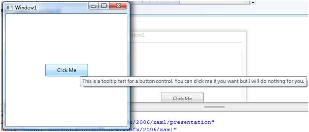
Figure 1. A simple Tooltip
As I said earlier, a Tooltip can host any number of controls. For example, in the below code, a button tooltip hosts a StackPanel with two children StackPanels. First StackPanel hosts an image and a text block and second StackPanel hosts a larger textblock. The output looks like Figure 2, which is a fancy tooltip.
<Button Width="100" Height="30">Click Me
<Button.ToolTip>
<StackPanel Background="Honeydew" Height="200" Width="200">
<StackPanel Background="BurlyWood" Height="30" Width="200"Orientation="Horizontal" HorizontalAlignment="Left" VerticalAlignment="Top" >
<Image VerticalAlignment="Top" Width="30" Height="30"Source="C:\Projects\XAML\FancyTooltip\FancyTooltip\samp.png" Name="image1" />
<TextBlock FontFamily="Aharoni" FontSize="24" FontWeight="Bold"Foreground="Black" TextWrapping="Wrap" VerticalAlignment="Top" Height="30"HorizontalAlignment="Right" Width="143">
<Run FontFamily="Andalus" FontSize="18" FontWeight="Normal" Text="Hello! Fancy Tip"/>
</TextBlock>
</StackPanel>
<StackPanel Width="200" Orientation="Horizontal" HorizontalAlignment="Left"VerticalAlignment="Top" >
<TextBlock TextWrapping="Wrap" Foreground="#FFF9F4F4"TextAlignment="Center" Background="{x:Null}" HorizontalAlignment="Right" VerticalAlignment="Top"Width="181" Height="98">
<Run FontFamily="Verdana" FontSize="11" FontWeight="Normal"Foreground="#FF151514"
Text="Format your tip the way you want and put any image, text or other controls on it.
Also, you can add more controls in this tip the way you want to format it."/>
</TextBlock>
</StackPanel>
</StackPanel>
</Button.ToolTip>
</Button>
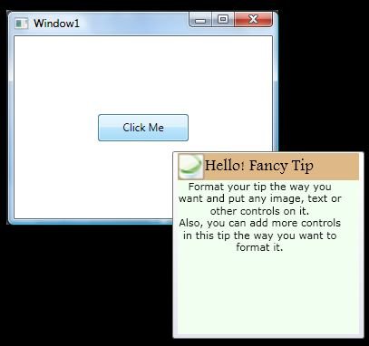
Figure 2. A fancy tooltip
Using this approach, you may design your tooltips the way you want.
Note: In the above code, you may want to change the source of the image file by changing the following code: Source="C:\Projects\XAML\FancyTooltip\FancyTooltip\samp.png"